
Today’s chosen theme: Creative Color Combinations for Tiny Rooms. Step into a world where hue, light, and texture collaborate to make compact spaces feel open, calm, and irresistibly personal. Subscribe to follow weekly bite-size color adventures tailored to small-space living.
Warm Versus Cool: Shrink or Stretch?
Warm colors advance and feel closer, creating intimacy that suits reading nooks and cozy corners. Cool colors recede, visually expanding walls and making ceilings seem higher. Balance warmth and coolness to guide focus, soften edges, and improve flow in tiny layouts.
The Power of Neutrals as Breathing Space
Soft neutrals offer visual rest, allowing bolder accents to shine without crowding the eye. Choose undertones thoughtfully: creamy neutrals warm northern light, while greige calms bright southern exposures. Neutrals also unify adjacent micro-zones, creating a seamless, airy rhythm.
Anecdote: The 220‑Square‑Foot Miracle
A renter layered pale sage walls, ivory trim, and a single brass lamp in a 220‑square‑foot studio. The sage cooled the space, the ivory erased edges, and the brass warmed evenings. Overnight, the apartment felt larger, calmer, and meaningfully more personal.

Light First: Reading Natural and Artificial Light
North-facing rooms get cool, steady light that flatters gentle, grayed colors. Dusty blues, soft sages, and mushroom taupes avoid glare and feel sophisticated. Test large swatches on multiple walls, then share your favorite results with our community for feedback.
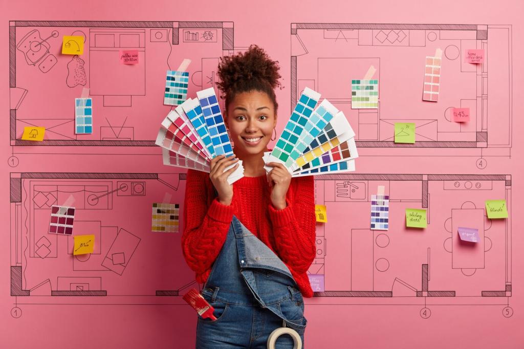

Smart Schemes: The 60‑30‑10 Rule for Tiny Rooms
Start with a high‑LRV base like pale linen, cloud white, or whisper gray. The dominant color should smooth visual seams between walls and ceiling, gently reflecting light. Sample at different times of day, then tell us which undertone made your room breathe.
Smart Schemes: The 60‑30‑10 Rule for Tiny Rooms
Layer a secondary hue across curtains, a rug, or a single painted wall. Sage, powder blue, or warm taupe add sophistication without clutter. Maintain continuity through sightlines so adjoining micro‑zones feel harmonious rather than chopped into tiny, disconnected boxes.
Illusion Tricks with Color Placement
Color‑Draped Ceilings to Lift Height
Pull the wall color onto the ceiling by a few inches to erase a hard horizon line. Alternatively, tint the ceiling two shades lighter than the walls for a gentle rise. Share before‑and‑after photos if you try this illusion in your own tiny room.
Low‑Contrast Trim to Erase Boundaries
Painting trim and doors similar to wall color reduces visual noise and makes walls appear longer. Tone‑on‑tone schemes highlight form without slicing the room. If you love classic white trim, choose a softer white to keep edges from popping aggressively.
Zoning Without Walls
Use color blocks to define zones across one continuous room: a desaturated blush arc for dining, a pale blue rectangle behind a desk. These gentle boundaries guide behavior without adding furniture. Subscribe for templates and share your most successful color‑zone layouts.
Unexpected Combinations That Succeed in Small Spaces
Pale Peach, Fog Gray, and Oxidized Blue
Pale peach warms skin tones and mornings. Fog gray steadies the palette. Oxidized blue, used sparingly on a stool or frame, sharpens edges without heaviness. Try this trio, then tell us where you placed the blue for maximum charm.
Minted Sage, Mushroom Taupe, and Burnt Caramel
Minted sage cools sunlit rooms while mushroom taupe grounds textiles. Burnt caramel accents in leather or ceramics bring earthiness and depth. This trio feels calm but inviting. Post your swatches, and we will feature reader rooms in next week’s spotlight.
Charcoal Navy, Linen White, and Sunlit Mustard
Use charcoal navy on the smallest wall to avoid shrinking. Linen white unifies ceiling and trim. Sunlit mustard appears in art or a throw for energy. Keep reflective surfaces nearby, and comment with tips for balancing drama and brightness in tight quarters.
Textures, Finishes, and Materials that Amplify Color
Matte vs. Eggshell on Walls
Matte hides imperfections and diffuses light, ideal for older apartments. Eggshell adds gentle washability with slight sheen. Test both near windows and lamps to see how shadows read. Share your preference and why it works for your compact space’s daily rhythms.
Gloss on Trim and Small Surfaces
A satin or semi‑gloss on trim bounces light without shouting. Try gloss on a mini bookshelf or side table for a subtle jewel‑like moment. Keep colors related to the walls for sophistication, and tag us when you complete your mini gloss experiment.
Textiles: Translating Color into Touch
Color feels richer through texture. Linen curtains soften bright hues, boucle pillows add cozy depth, and flatweave rugs keep patterns calm. Build a tactile palette board, photograph it in room light, and subscribe for our printable guide to texture‑color pairings.