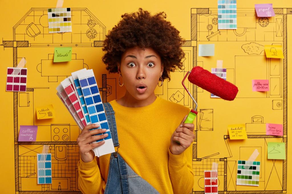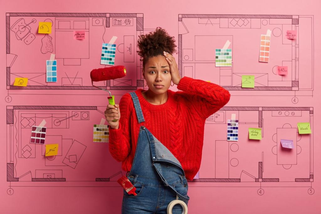
Palette Building for Studio Apartments
Pick a soft, low-saturation anchor that ties the envelope—walls, larger furniture, or rugs—into one continuous field. A gray-green or foggy beige can steady visual rhythm and set mood. Drop your anchor candidates below, and we’ll suggest undertone pairings.
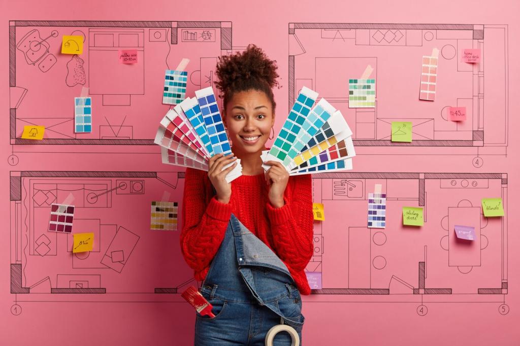
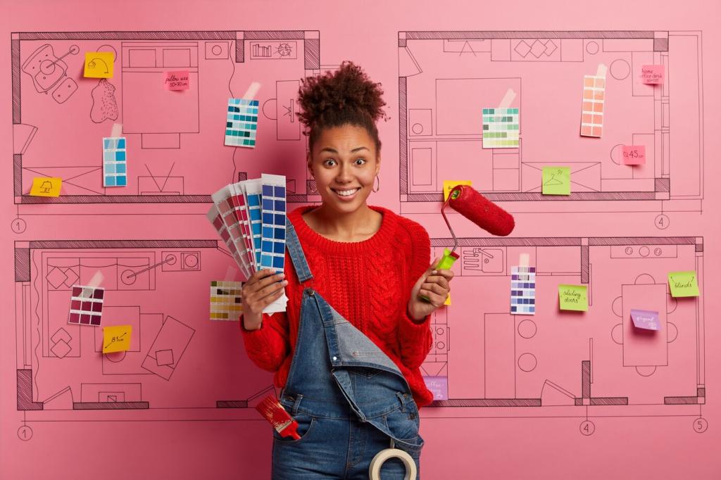
Palette Building for Studio Apartments
Secondary shades should pivot off shared undertones. If your anchor leans cool, keep supporters cool to prevent choppiness. Use them on cabinetry, textiles, and doors to guide the eye. Ask for our quick undertone test to avoid clashing surprises.